I deeply enjoy the conversations that lead to an understanding of what is essential about who my clients are and what they do. We often start with that explorative discussion, proceed to three rough concepts, deepen the development of a chosen concept, and complete the project with delivery in versions and formats that meet client needs. I'm also perfectly happy diving right in when clients already have a clear vision of what they want.
• • •
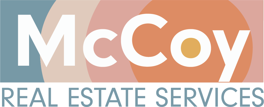
A family-owned Menomonie real estate group needed a new logo with a clean and timeless retro/modern feel. Stephanie likes sunset colors, so the comps all incorporated them. She was a joy to work with!
• • •
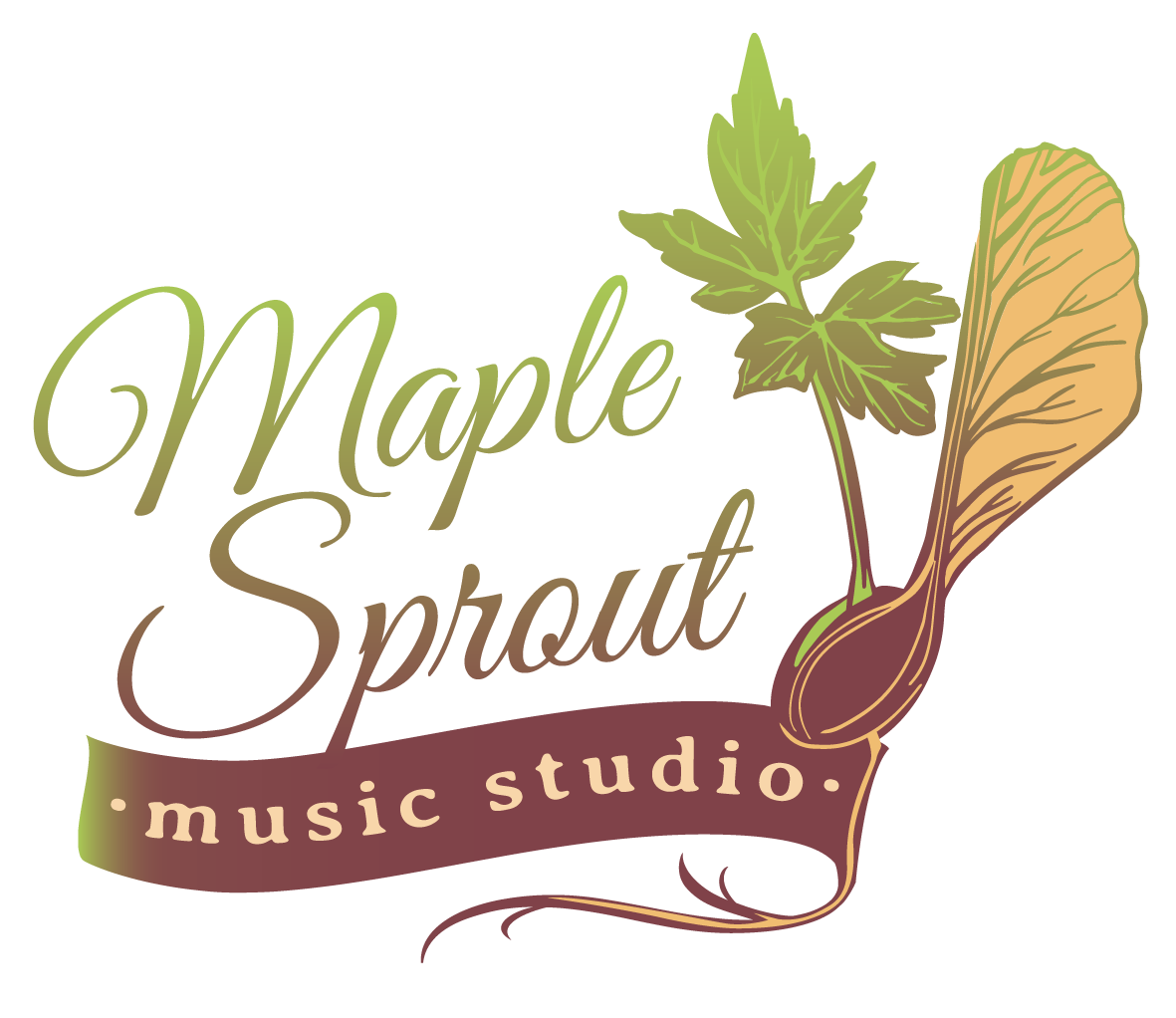
A music teacher starting a new business in Menomonie named her business after the many seedlings found every year in her lawn. I like that the maple seed has the shape of a musical note in it, and that a sprouting seed speaks to opportunities for growth.
• • •
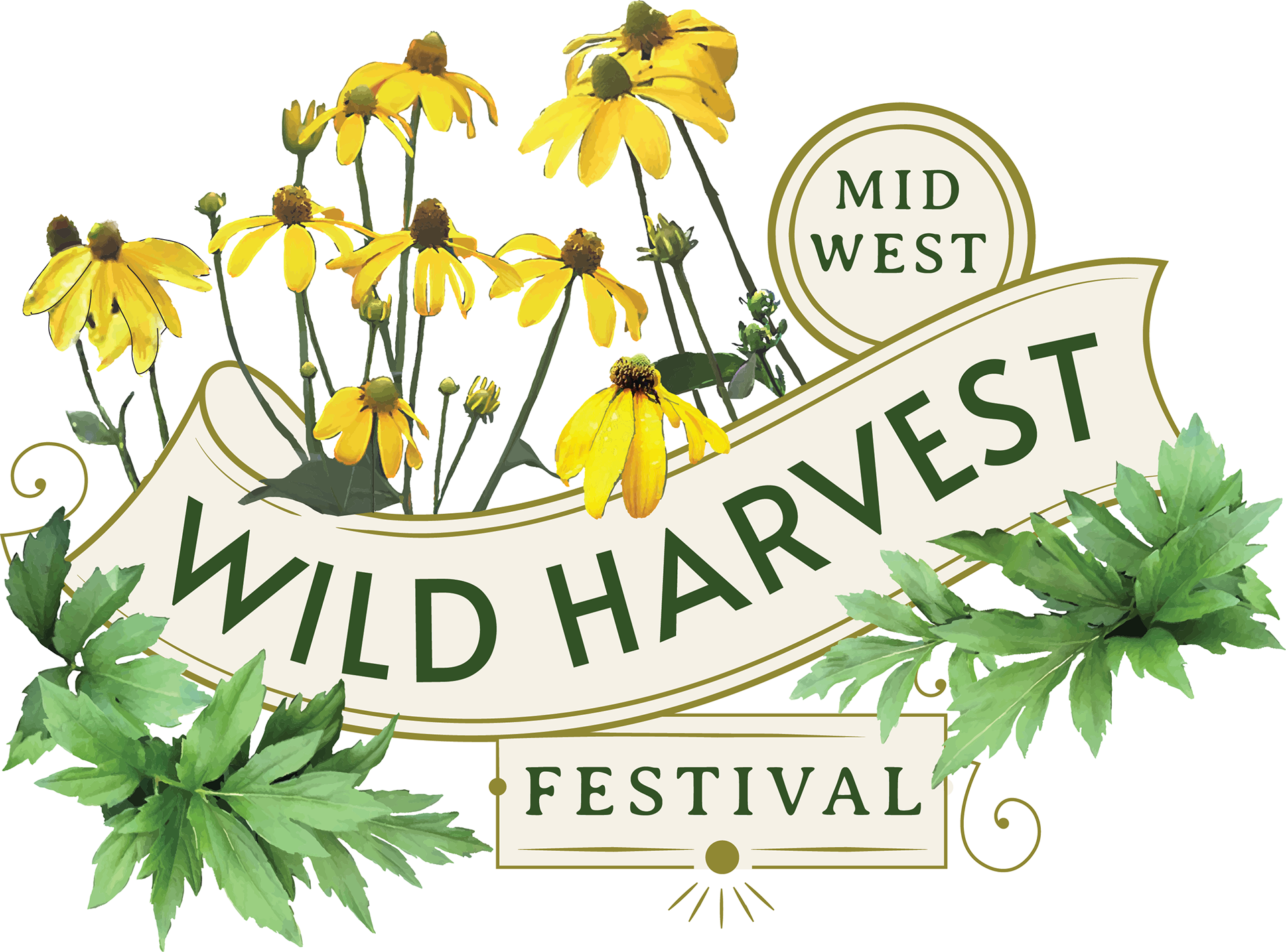
Midwest Wild Harvest Festival had a limited budget, and a great logo template I purchased from Heritage Type helped save time and money. The client wanted Sochan featured, so I compiled source images to form the foundation for making floral elements in Adobe Illustrator. They'll be using the logo on their website, tshirts, and tote bags.
• • •